Stats
The Stats screens give you a long-range view of your health data across every tracked domain. Each stats screen shows a 7-day bar chart and a 6-month bar chart, with summary tiles below. Stats screens open on a dark background with a light grey header.
Opening Stats
Tap the bar chart icon (Analytics tab, 5th in the bottom navigation) to open the Stats section. You can also reach specific stats screens by tapping your Awra Score on the Home screen.
Health Score Trends
Shows your Awra Score (0–100) for each of the last 7 days and as a monthly average over the last 6 months. Summary tiles show Average Score and Best Score.
The score is a composite across nutrition, sleep, hydration, and movement — so consistent logging in all domains is what drives score stability over time.
Nutrition balance trends
Sleep trends
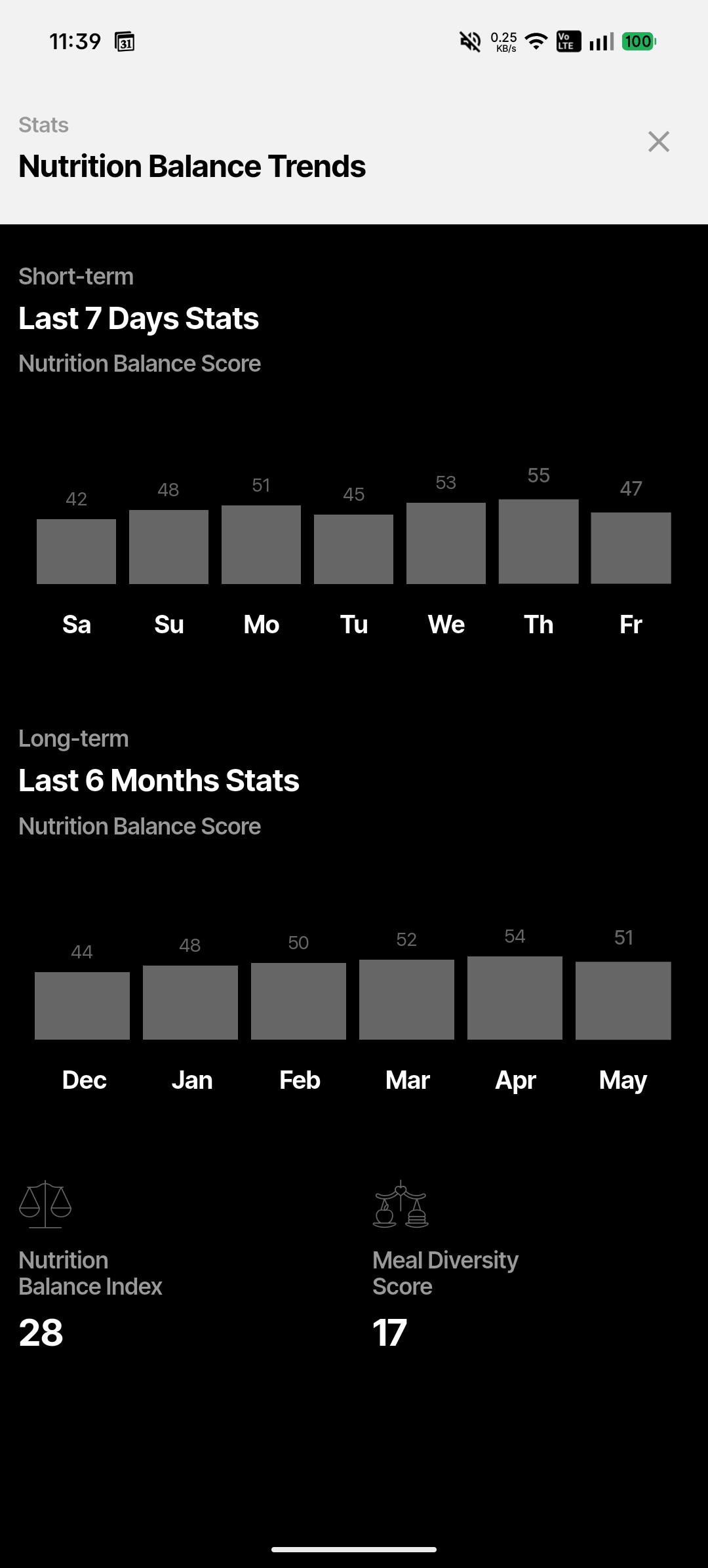
Nutrition Balance Trends
Tracks your Nutrition Balance Score — a daily measure of how well your food log balanced calories, protein, and overall macro distribution against your personal targets. Summary tiles show Nutrition Balance Index and Meal Diversity Score.
Macro Nutrition Trends
Shows a stacked bar chart of daily macros — Protein (white), Carbs (dark grey), Fat (medium grey), and Fiber (light grey). Summary tiles show Days Protein Goal Met and Days Calories Goal Met as percentages.
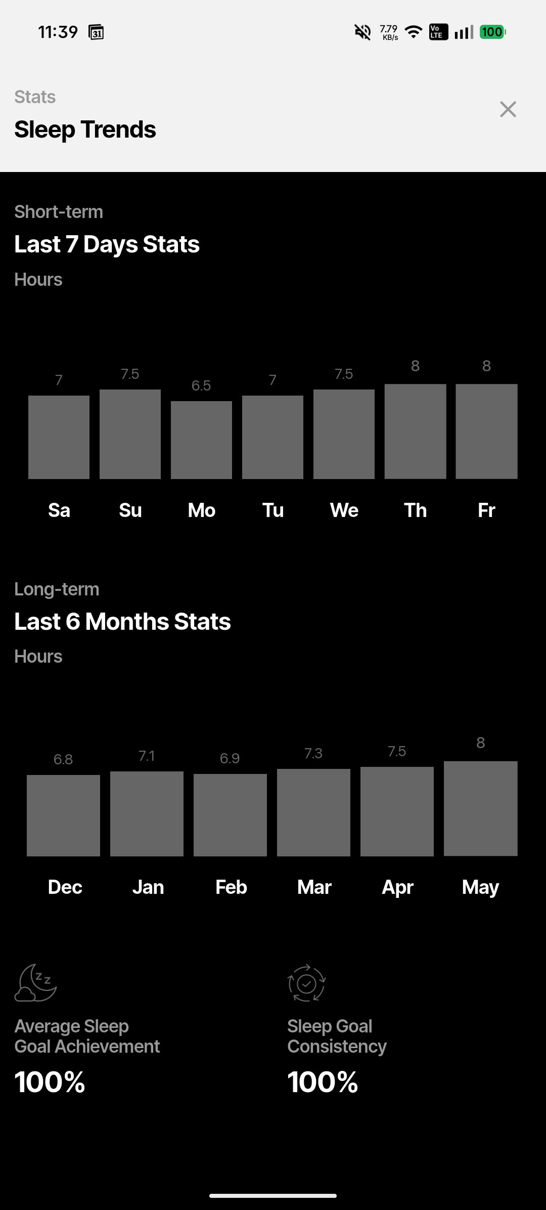
Sleep Trends
Shows hours slept per day for the last 7 days and as a monthly average for 6 months. Summary tiles show Average Sleep Goal Achievement and Sleep Goal Consistency as percentages.
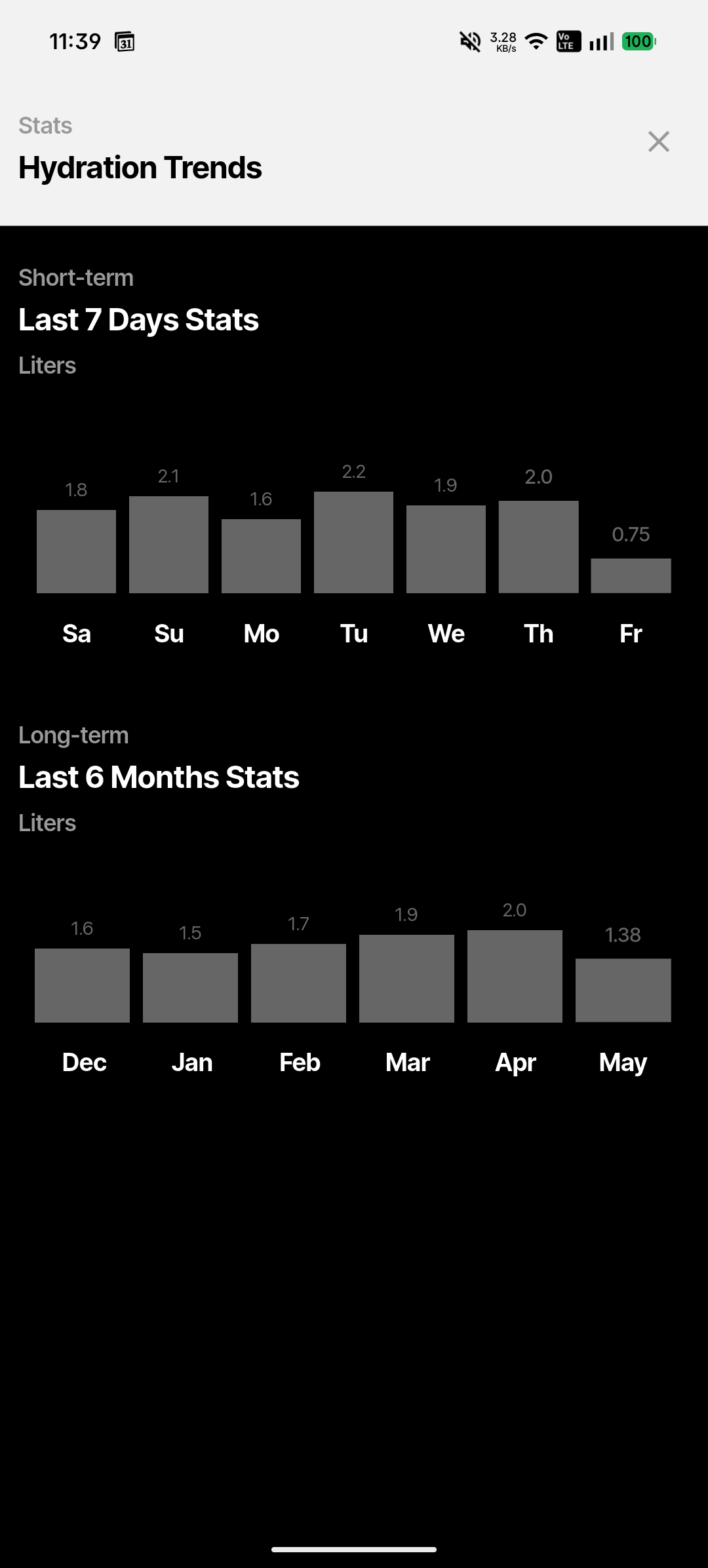
Hydration Trends
Shows daily water intake in litres (glasses × 0.25L). The short-term chart covers the last 7 days; the long-term chart shows your monthly average over 6 months.
Activity Trends
Shows daily active minutes and includes a breakdown of your physical activity habits' frequency over the last 6 months. Walking minutes you log via the Walking screen appear here.
Navigating between stats screens
Each stats screen has a ✕ close button in the top-left corner of the header to return to the previous screen. You can also swipe or scroll horizontally between screens if supported by your device.
Data note
Stats screens only show data for days you've actively logged. Bars for days with no entries will appear as zero — this is expected, not a bug. Consistent daily logging gives you the most useful trend view.